Pretty Doesn't Convert. Flow Does.
Everyone wants a design that looks beautiful. Almost nobody asks the only question that matters: does it work? A screen can win awards and still lose customers if people can't figure out where to tap, what to do next, or why they should bother. Good UI/UX isn't decoration — it's the invisible path that walks a stranger from "never heard of you" to "take my money" without making them think. Here's how we design for that.
1. Design the flow, not the screen. Most people design pages one at a time and hope they add up to something. Users don't experience pages — they experience a journey: land, understand, decide, act. We map that whole path first, so every screen has one job and quietly hands off to the next. When the flow is right, the individual screens almost design themselves.
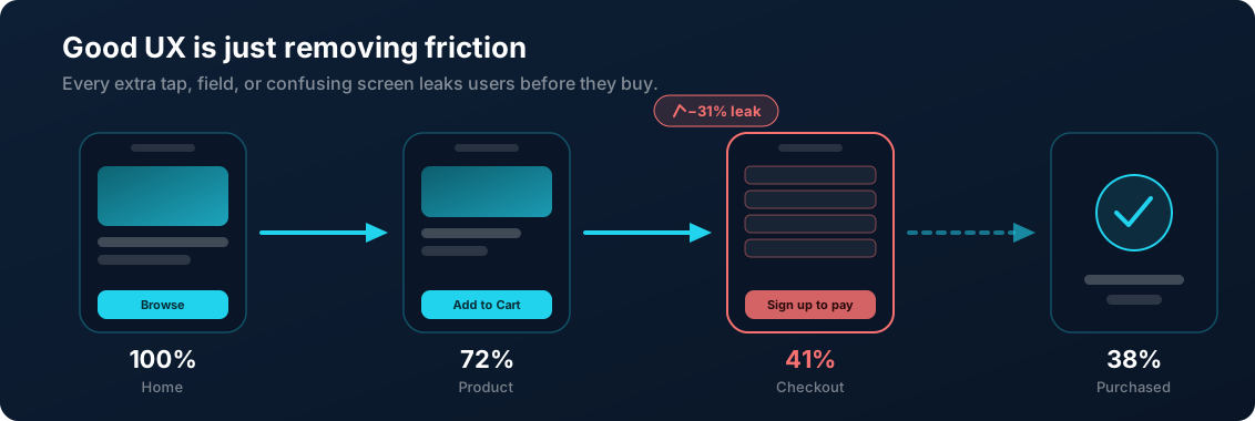
2. Remove friction before you add features. Every extra tap, every form field, every "are you sure?" is a door some users will walk back out of. The fastest way to lift conversions usually isn't adding something — it's deleting the steps, choices, and confusion that were leaking users all along. Great UX feels like less, not more.
3. Prototype before you build. Writing code is the most expensive way to find out an idea doesn't work. A clickable prototype lets you walk through the real flow, hand it to actual humans, and watch where they hesitate or get lost — in days, not months. Fixing a confusing layout in a prototype costs an afternoon. Fixing it after launch costs a rebuild.
4. Design for the thumb, not the showcase. Your design gets judged on a phone, one-handed, on a slow connection, while someone is half-paying-attention. That's the real test — not a giant monitor in a pitch deck. We design mobile-first, with tap targets you can actually hit, text you can read, and a layout that holds together on the screen most of your customers are actually using.
5. Build a system, not a pile of screens. One-off designs drift: buttons stop matching, spacing gets random, and every new page reinvents the wheel. A design system — consistent components, colors, and rules — keeps everything coherent as you grow, makes new features faster to ship, and means your product feels like one product instead of five freelancers' weekends stitched together.
Beautiful is easy to promise and hard to measure. We'd rather design something that's clear, fast, and quietly guides people to the thing they came for — because that's what actually grows a business. If you want screens that look sharp and convert, designed from the flow up and tested before a line of code is written, that's exactly what we do at Marknesty Tech.
Ready to grow your brand?
Let's talk about your goals and how we can help.